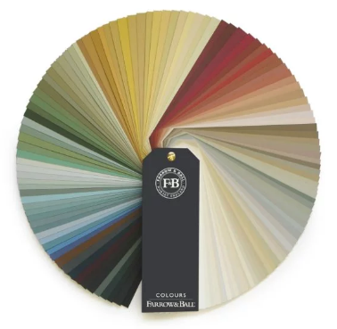
Farrow & Ball Colours - C
Chappell Green #83
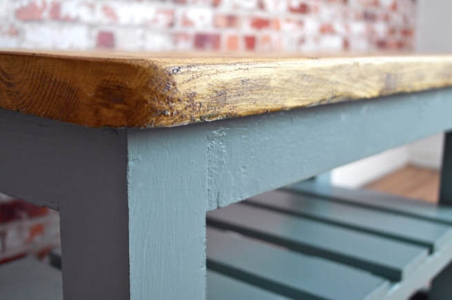
A subdued blue-green
Chappell Green is both slightly greener and more intense than Green Blue, but shares its changeable nature, reading blue when contrasted with warmer tones and green when paired with cooler shades. Very cheerful and welcoming, it is a great favourite for kitchens.
Chappell Green is both slightly greener and more intense than Green Blue, but shares its changeable nature, reading blue when contrasted with warmer tones and green when paired with cooler shades. Very cheerful and welcoming, it is a great favourite for kitchens.
Charlotte's Locks #268
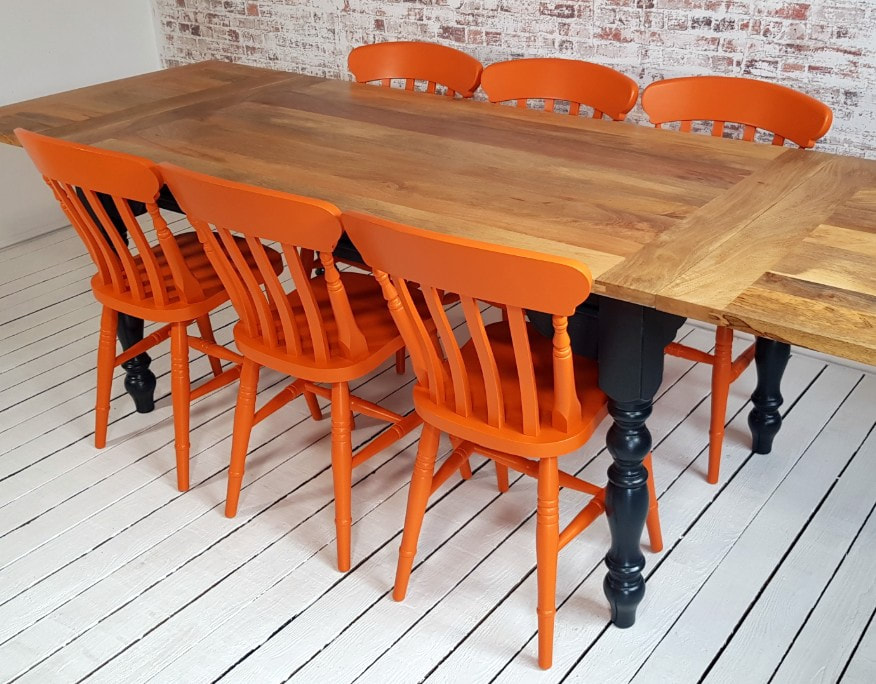
A deep and playful orange
Charlotte's Locks takes its inspiration from the flame red hair of our Head of Creative and brings a playful late 1970s look. This deep and dramatic orange is particularly spectacular when used in small areas with a sharp contrast either in All White or Black Blue.
Charlotte's Locks takes its inspiration from the flame red hair of our Head of Creative and brings a playful late 1970s look. This deep and dramatic orange is particularly spectacular when used in small areas with a sharp contrast either in All White or Black Blue.
Cornforth White #228
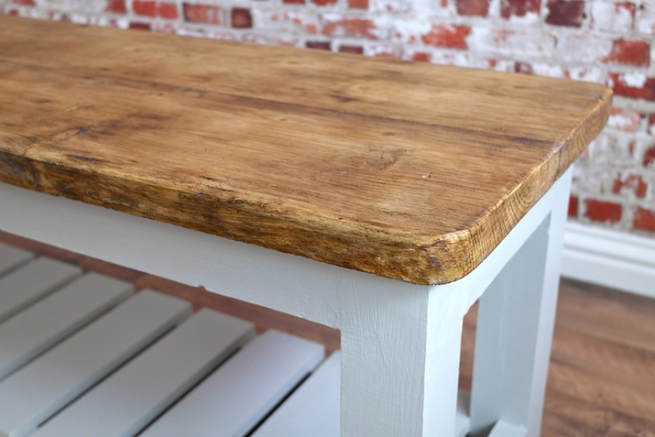
An understated grey
Cornforth White is the mid tone in the group of Easy Neutrals which are totally understated and extremely versatile. Neither too warm nor too cool, Cornforth White sits contentedly between Ammonite and Purbeck Stone to create a hushed and calming retreat. Named in memory of John Cornforth, the revered architectural historian, contrast with Wevet to enhance its grey qualities.
Cornforth White is the mid tone in the group of Easy Neutrals which are totally understated and extremely versatile. Neither too warm nor too cool, Cornforth White sits contentedly between Ammonite and Purbeck Stone to create a hushed and calming retreat. Named in memory of John Cornforth, the revered architectural historian, contrast with Wevet to enhance its grey qualities.
Cromarty #285
|
A muted green grey
This very light green grey is named after the Cromarty Firth estuary, a place of swirling mists mentioned daily in the Shipping Forecast. A neutral yet atmospheric colour, Cromarty brings a muted softness to any room, creating an easy to use finish that is neither too green nor too grey. A shade lighter than Mizzle, it works beautifully when grouped with Blue Gray or Pigeon.
This very light green grey is named after the Cromarty Firth estuary, a place of swirling mists mentioned daily in the Shipping Forecast. A neutral yet atmospheric colour, Cromarty brings a muted softness to any room, creating an easy to use finish that is neither too green nor too grey. A shade lighter than Mizzle, it works beautifully when grouped with Blue Gray or Pigeon.